estro
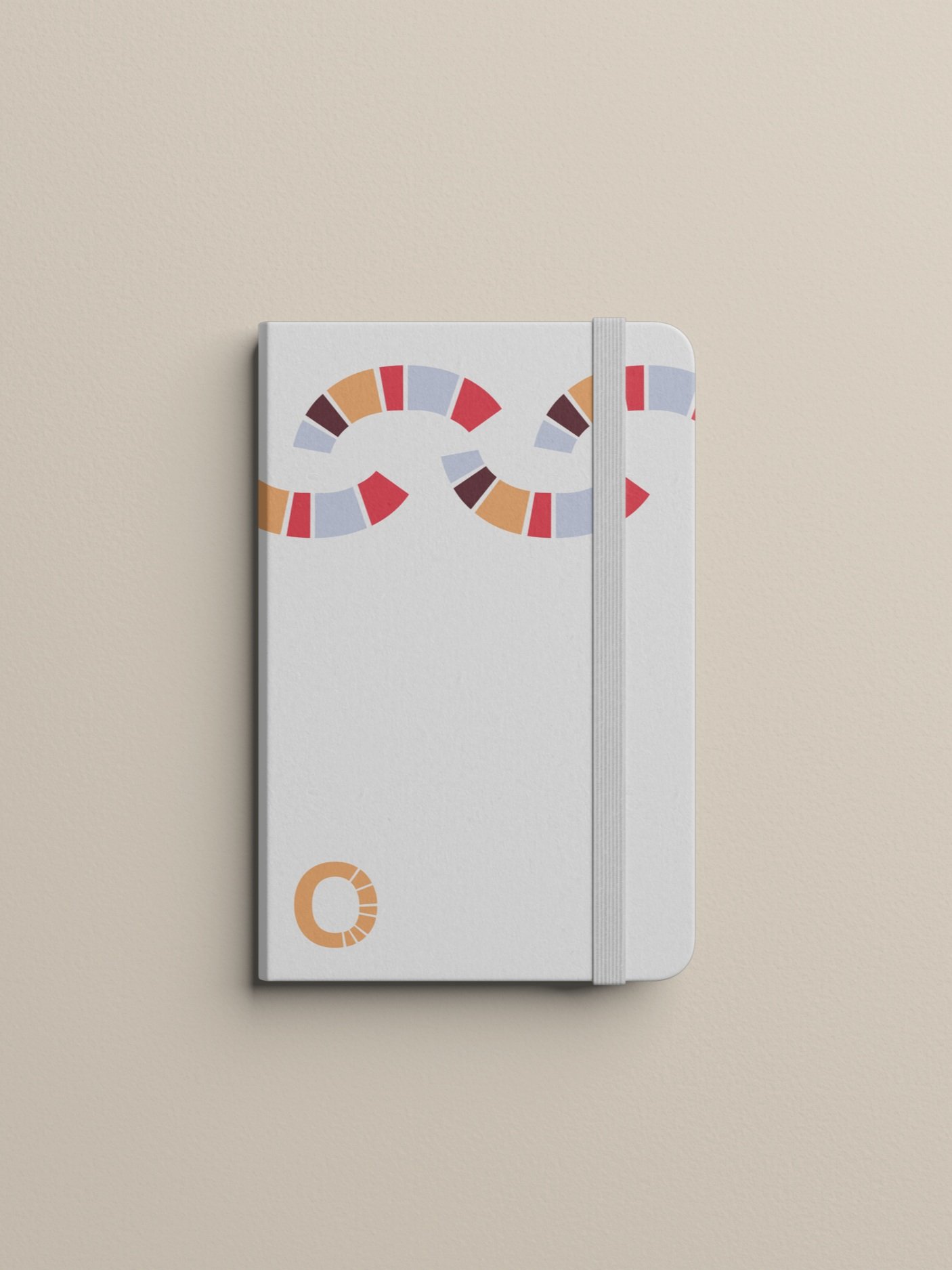
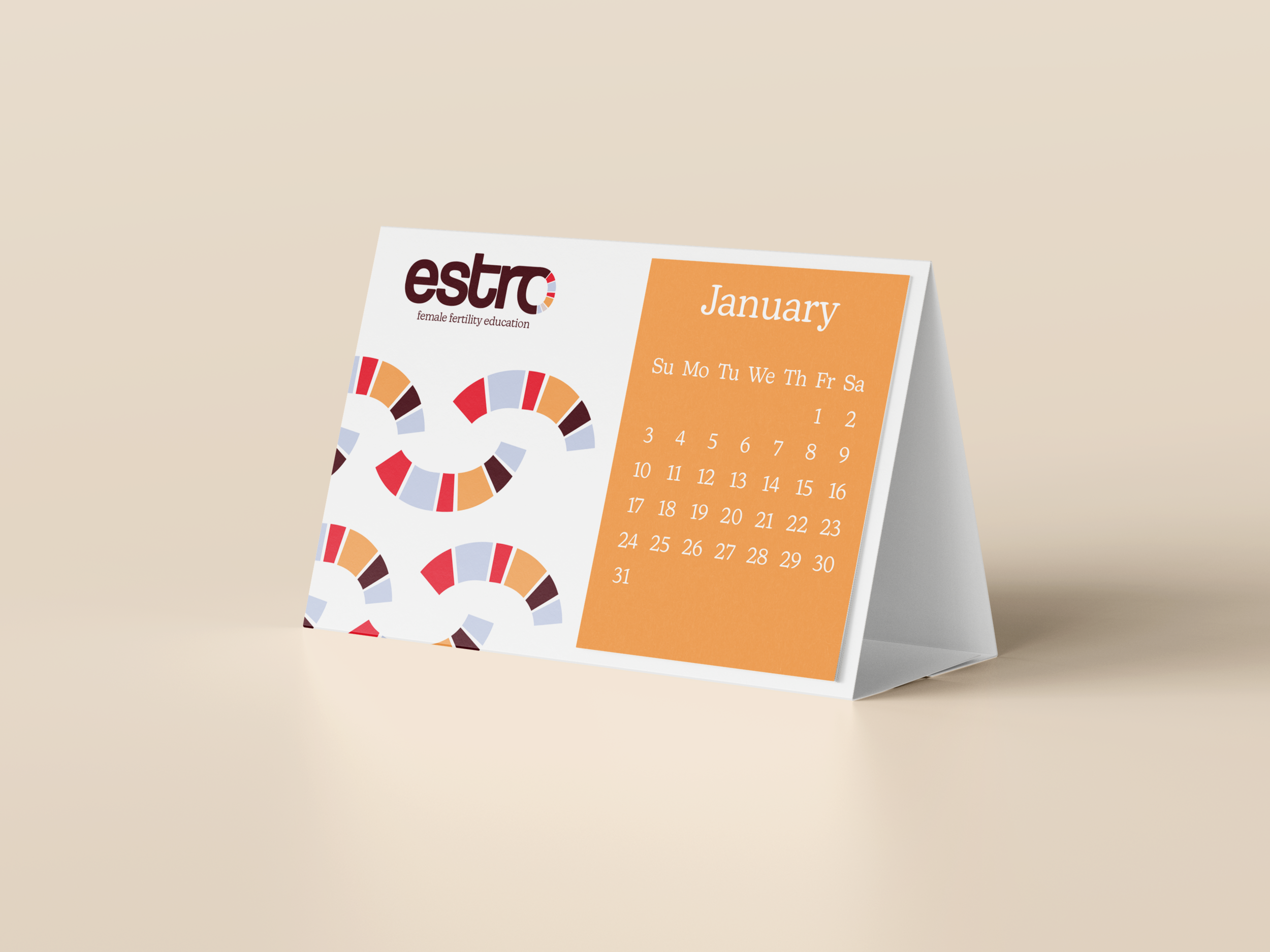
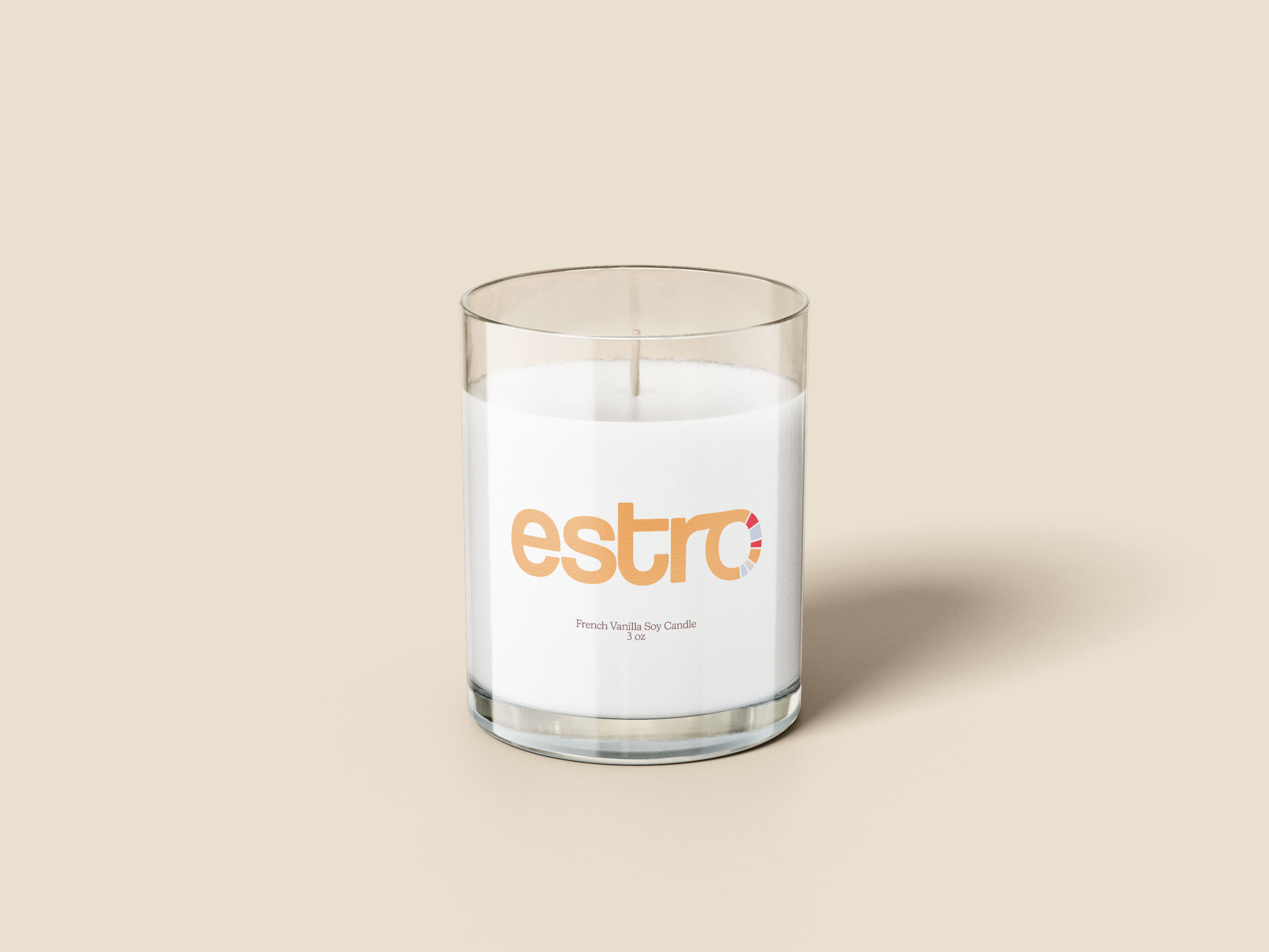
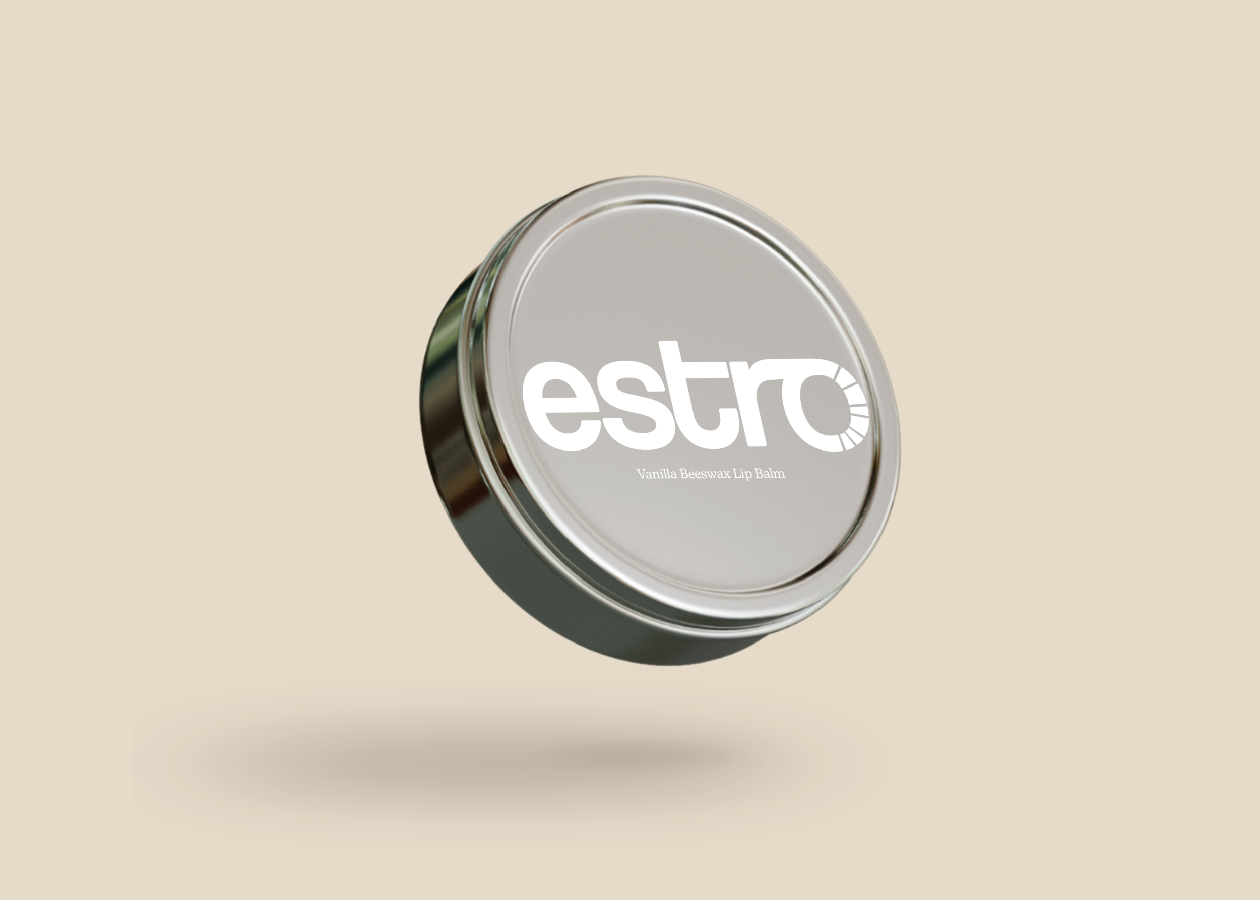
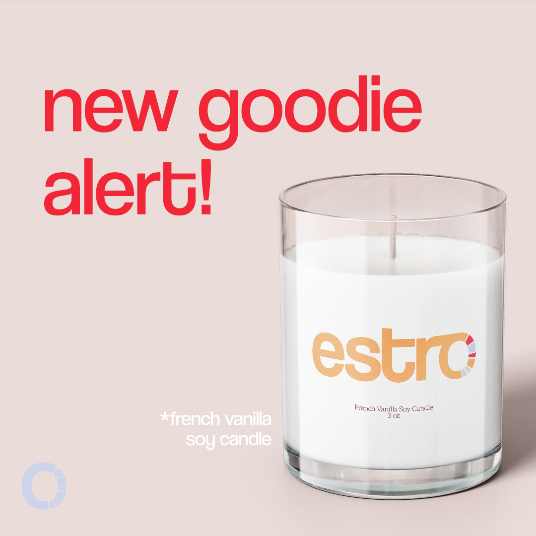
estro is a female fertility education resource. the brand’s identity was to be modern, welcoming, and empowering to the women using the services provided. the brand language is casual and friendly in order for user comfortability. the logo is a bold type with rounded corners to show the strength and softness that women exude. the color palette represents those ideals with bold colors being accented with lighter colors. the system was a bundled kit that included: branded box, notebook, calendar, lip balm, candle, essential oil, ovulation tests, a pen, and thank you card. an Instagram account was also created in order for the brand to spread education on female fertility.






want to know more about the brand? check out this brand guide below!

